Pages

Showing posts with label grey. Show all posts

Sunday, May 29, 2016

China Glaze - Sea Spray (Anchors Away Collection, Spring 2011)

Having a no-buy policy makes me dive into the archives and find all kind of undiscovered gems! That is how I unearthed China Glaze Sea Spray, from the lovely Anchors Away Collection of 2011.
Sea Spray is a grey blue, blue leaning grey, grey leaning blue with a subtle hint of pearly shimmer. The shimmer is apparent in the bottle but on the nail it gives the polish more of a deepening effect preventing it to be a creme. The grey/blue was very light "reactive", in some lights it appears more of a light grey and in some it is more a greyish blue!

This is two layers with base and top coat:

China Glaze Sea Spray
China Glaze - Sea Spray

China Glaze Sea Spray

China Glaze Sea Spray

China Glaze Sea Spray

China Glaze Sea Spray

China Glaze Sea Spray

Wednesday, May 25, 2016

OPI - Embrace the Gray, OPI - Fly & OPI - Uh-Oh Roll Down the Window

As I said in my previous post: Embrace the Gray is a nice canvas for nailart......the proof is in the pudding!
I combined it here with OPI Uh-oh Roll Down the Window (Touring America Collection Fall 2011)
and OPI Fly (Nicki Minaj Collection 2012) in a kind of waterfall brushstroke art thing. In real life it was a bit more outspoken but not by much: I like the muted tones even though Fly is fairly bright. It was a nice and quick tip wear cover up ;-)

OPI Embrace the Gray, OPI Fly, OPI Uh-Oh Roll Down the Window
OPI - Embrace the Gray & OPI - Fly & OPI - Uh-Oh Roll Down the Window

OPI Embrace the Gray, OPI Fly, OPI Uh-Oh Roll Down the Window

OPI Embrace the Gray, OPI Fly, OPI Uh-Oh Roll Down the Window

OPI Embrace the Gray, OPI Fly, OPI Uh-Oh Roll Down the Window

OPI Embrace the Gray, OPI Fly, OPI Uh-Oh Roll Down the Window

Sunday, May 22, 2016

OPI - Embrace the Gray (OPI Fifty Shades of Grey Collection 2015)

The Fifty Shades of Grey Collection wasn't a very memorable one for me: there was the obligatory red creme, the these days unavoidable silver and a bunch of greys >duh<
Embrace the Gray was the one that spoke most to me, so that was the one I bought.
It is a medium grey, not too dark, not too light and neutral in tone.
Very wearable and probably lovely as a canvas for some glitter or stamping!

OPI Embrace the Gray
OPI - Embrace the Gray

OPI Embrace the Gray

OPI Embrace the Gray

OPI Embrace the Gray

OPI Embrace the Gray

Monday, December 21, 2015

A-England - Captive Goddess (Rossetti's Goddess 2015)

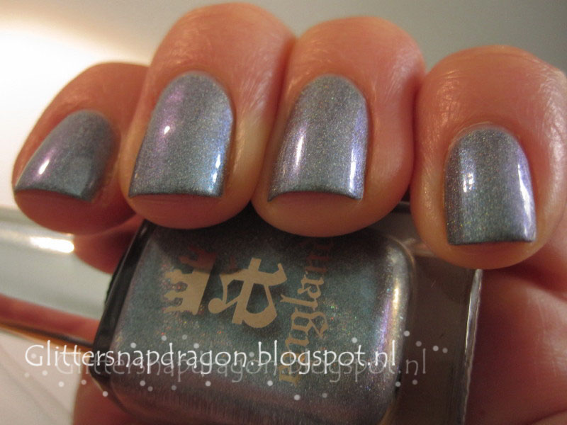
Wow, this is a complicated shade of ...what exactly? A-England describes it as a complex holographic blend of cerulean blue, aquamarine green and muted purple veiled by a silver grey shadow. The base is a grey with a hint of petrol/steel blue, there is a hard flash of cerulean blue, a soft shimmer of lilac and some faint green shimmer at the edges and to top it of there is the soft holo dusting. The colour reminds me of a labradorite stone, I have earrings with that stone so I made a picture with it for comparison.
The formula is lovely, this a two buttery coats.

A-England Captive Goddess
A-England - Captive Goddess

A-England Captive Goddess

A-England Captive Goddess

A-England Captive Goddess

Monday, February 2, 2015

Essie - Take it Outside (Dress to Kilt Collection, autumn 2014)

Long time no see.....
But I'm back again with yet another beauty from the Dress to Kilt collection: Take it Outside.
TIO is a Pantone warm grey, or greige, or beige with strong grey undertones or grey with a hint of beige (or a lighter version of Chinchilly). The formula was lovely, two easy coats and you're done!

Essie - Take it Outside

Essie - Take it Outside

Essie - Take it Outside

Essie - Take it Outside

Essie - Take it Outside

Essie - Take it Outside

It's a very lovely neutral without being stark and washed out or giving you mannequin nails.
I'm loving the neutrals these days, there are these periods when you just needs specific colours and the last few weeks it is neutrals for me: I'll show you some more in the coming days!

Formula: 4/5
Durability: 3/5
Shine:4/5
Colour: 5/5
Overall: 4/5

Tuesday, July 29, 2014

Essie - Fair Game (Fair Game, Resort Collection 2011)

Polish on holiday number 4:

Ahhh, game watching in a resort in Africa >hmmmmm< sounds wonderful!

In the mini bottle I like Essie's Fair Game, it is a steel blue/grey with a hint of green, very edgy I thought ("I might even need it in a big bottle" I was contemplating..).
But then on the nail: *not so hot* I'm afraid.
It is way too frosty to my taste and the green is completely gone. It looks like a frosty steel grey with a hint of blue.

Essie Fair Game
Essie - Fair Game

Essie Fair Game

Essie Fair Game

Essie Fair Game

Essie Fair Game

Essie Fair Game

Essie Fair Game

In the pics it looks better then in real life, I must admit. The formula was OK, a bit liquid but workable...this was two layers >I think< it could be three.
But the conclusion is: I don't need a big bottle of this one, YAH saving money here!!!

Monday, April 21, 2014

Essie - Cocktail Bling (Winter 2011 Cocktail Bling Collection)

Today I have Essie's Cocktail Bling for you, it is a neutral bluish grey that morphs between blue and grey depending on the light. It is from the 2011 winter collection but I really like to wear it now in spring as well.
The application was wonderful, two very easy coats.

Essie Cocktail Bling
Essie - Cocktail Bling

Essie Cocktail Bling

Essie Cocktail Bling

Essie Cocktail Bling

Essie Cocktail Bling

Essie Cocktail Bling
I love it; it is a very wearable colour and it looks very chique and fresh at the same time!


Sunday, December 22, 2013

Essie - Cashmere Bathrobe (For The Twill Of It Collection, autumn 2013) and China Glaze - Fairy Dust

It has been a while....it was a hectic two weeks: celebrating Sinterklaas at school, at home and with the grandparents. Preparing for X-mas, extra swimming lessons for the little guy, visits to the hospital (nothing earth shatteringly  major...but it needed its time) there just wasn't any time left to blog!

But today I have a new polish for you: Essie's Cashmere Bathrobe. It is a lovely slate gray with some light shimmer in it (I looked at it very, very carefully and I can say that the shimmer seems to be green en pink....in most lights it just looks silver). I had difficulty capturing the shimmer in the pictures...the green and pink proved to be totally illusive....

Essie Cashmere Bathrobe
Essie - Cashmere Bathrobe

Essie Cashmere Bathrobe

Essie Cashmere Bathrobe

Essie Cashmere Bathrobe

Essie Cashmere Bathrobe
I used Essie Protein basecoat and Good To Go topcoat and yet it chipped on day one....tiny chips but chips all the same. So I decided to carefully restore the mani and add a layer of sparkle, it's December after all!
China Glaze Fairy Dust
China Glaze - Fairy Dust

China Glaze Fairy Dust

China Glaze Fairy Dust

China Glaze Fairy Dust
The result was Cashmere Bathrobe on steroids or something.....it had the same character but with added pazazz. I wore it for two more days with loads of pleasure :-)

Monday, October 21, 2013

Kiko Quick Dry - 818 topped with Cirque - Au

What to wear to a formal event?
Well, something neutral with a festive touch...I choose Kiko Quick Dry nr. 818 topped off with Cirque Au.
The 818 looks a little lighter in the bottle then on the nail, which was a pitty because the complete look was a bit sombre this way. But all in all I liked the result good enough :-)

This was two easy coats of the 818 and one thin coat of Au (and that even gave almost too much gold leaf...it's loaded with the stuff!).

Kiko Quick Dry 818 Cirque Au
Kiko Quick Dry - 818 and Cirque - Au

Kiko Quick Dry 818 Cirque Au

Kiko Quick Dry 818 Cirque Au

Kiko Quick Dry 818 Cirque Au
Gold leaf top coat is always a nice conversation starter, so the combo worked like a charm ;-)